A Spectrum of Color
Pyrex Color Ware
While Pyrex ovenware in clear glass had been massively successful for nearly 30 years, it was the introduction of the color ware in the 1940s that cemented its place in kitchenware history. It all began with the iconic primary-colored set of four mixing bowls in yellow, green, red, and blue, and took off from there.
Over the years, the colors offered were reflections of the tastes of the times. The cheerful early primary colors of the 1940s were soon joined, albeit briefly, by lime green and flamingo pink. The 1950s were rounded out by turquoise, pink, and pale yellow.
The 1960s first brought warmer tones and pastels like Sandalwood and Early American, suceeded later in the decade by the brighter colors of Daisy. The popularity of avocado greens in the late '60s was reflected in Verde.
In the 1970s, the bright colors of the late 1960s continued with Friendship, but gave way to earthtones and rustic shades in the latter half of the decade. Avocados and harvest golds continued in Spring Blossom Green and Butterfly Gold, respectively,
Things To Know About Colors
- Primary color mixing bowls were described in early advertising as Canary Yellow, Jade Green, Chinese Red, and Robin Egg Blue.
- The shades of the original orange-red 402 mixing bowl, the later red 402, the red 402 from the Friendship pattern collection, and the red-orange 402 from the 1968 new multi-color 400 set are all slightly different.
- The exact shades of the green 403 and blue 401 primary color mixing bowls also varied slightly over time.
- The shades of yellow on the 400 series mixing bowls from the original multi-color, the all-yellow set, and both the Town & Country and the Daisy pattern collections are all noticeably different.
- Many non-standard colors appeared only on promotional pieces.
- Metallic decorative patterns apparently did not adhere well to bare opal glass, so they are always seen on applied color finishes, including white.
- Non-metallic decorative patterns on white bowls usually are on bare opal glass, the Colonial Mist blue on white pattern being an exception.
- The black color known as charcoal, used for both dishes and applied decoration, was a matte/satin finish and tends to show wear and damage more obviously than others.
- The Terra color finish was achieved by applying a dark color over a fired-on lighter color, then removing bands of the topmost with a spinning abrasive machine.
- Being a matte/satin finish, the Terra pattern also shows wear and damage more readily than others.
- Some pieces were offered as open stock in colors different from that of the same piece when supplied as part of a set.
Pyrex Color Differences
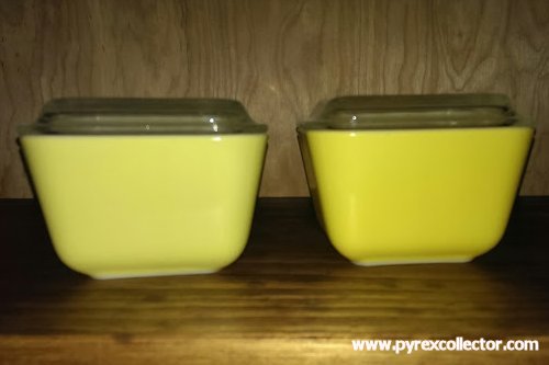
Subtle differences exist in shades of color from one pattern to another. When viewed alone, some shades might appear indistinguishable from others until both are seen side by side. Knowing the differences is important to the collector, lest a piece is purchased thinking it a match to a particular pattern, only to later find otherwise. Only in a handful of cases were the exact same colors used in more than one pattern. Some examples of differences are shown here.
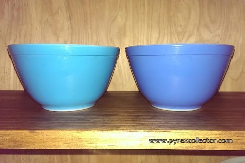
Original Multicolor blue 401 bowl (left) and New Multicolor blue 401 (right).
Verde yellow 501 dish (left) and Daisy yellow 501 (right).
Among the colors that do cross over are:
- The dark green Verde and New Multicolor #404 bowls
- The avocado Verde and Verde 2 #403 and #443 bowls
- The yellow #501 and green #502 dishes of Verde and Verde 2
- The orange Daisy and Friendship #043 oval casserole dishes
If you've found a solid color bowl or dish, and are unable to determine to which pattern it belongs, see the Pyrex Solid Color ID Chart.
Pyrex Catalog Color Suffixes
These codes were used in Pyrex distributor catalogs to let readers know the color options for each model pictured. Color suffixes are seen appended to catalog numbers, but should not be confused with pattern numbers, although in some cases the distinction can be somewhat vague.
|
0 - White (Opal)
1 - Red 2 - Yellow 5 - Sandalwood Tan 6 - Flamingo Pink 7 - Lime Green 18 - Pink 19 - Turquoise 500 - Multicolor A - Assortment (with *s to differentiate) |
Colors with more than one decoration were differentiated by letter codes after the color number, e.g.: O-TBP - Turquoise Butterprint on White 2 BGB - Black Gooseberry on Yellow 18 WGB - White Gooseberry on Pink O-TS - Turquoise Snowflake on White 18-WD - White Daisy on Pink 19-WS - White Snowflake on Turquoise 20-WS - White Snowflake on Charcoal 21-GA - Gold Acorn on Ivory |
Color numbers are not the same as pattern numbers, which also include some one or two digit numbers. Since some duplication exists between them, each must be viewed in context to determine to what they refer.
Pyrex colors can be difficult to discuss without photographs. Avocado to someone else may be olive green to you. One person's gold is perhaps butterscotch to another. And what Pyrex called lime might well have been dubbed honeydew or kiwi by a later generation of marketers.
Even with photos, the camera can deceive. Variations in camera sensors, flash, and ambient lighting can often misrepresent the actual colors of Pyrex pieces. For example, for any given 400 series bowl in yellow there are up to three different shades of that color it could be, and all are very close in appearance until held side by side.
For purposes of clarity, shades of colors described on this website will follow the old Crayola crayons convention. Therefore, a color described as orange-red will be more red than orange, and red-orange will be more orange than red.
A Pyrex Colors Timeline
1945 - Color ware introduced with primary color #400 mixing bowl set
1947 - Refrigerator storage set in primary colors
1949 - #404 4-quart mixing bowl in red offered open stock
1953 - Limited pieces in a special forest green made for and offered by Heinz
1955 - Desert Dawn debuts in pink and yellow
1956 - Color ware in shades of pale yellow, pink, and turquoise offered
1956 - Non-standard matte black casseroles produced for sale by third party
1957 - Mixing bowls in bright yellow #300 & #400 sets
1959 - Bakeware in "lime" green and "flamingo" pink
1959 - Ivory base color casseroles
1960 - Bluebelle, a blue tinted opal glass collection
1961 - Tan base color Sandalwood pattern
1964 - Terra, made from a two color, multi-coat, multi-step process
1966 - Mixing bowls in earthtones with rims left white used to fill out "Early American" collection
1967 - Verde pattern collection with its shades of avocado and yellow-green
1968 - Daisy pattern collection in bright yellows and orange
1968 - New multi-color mixing bowls in avocado, bright yellow, orange, and a new shade of blue
1969 - Horizon Blue pattern collection shade of turquoise-blue
1970 - "Bowl-a-Rama" gold and poppy red 401 and 402 singles offered
1971 - Baking pan set in brown tones made to go with Americana
1974 - Gradient base colors like FlameGlo and Old Orchard
1976 - Brown speckled beige base color on Homestead pattern collection
1978 - Base colors in shades of caramel and chocolate brown on Woodland pattern collection
1979 - Spring Blossom green base color changed from previous 1972 avocado version
1983 - A dark, almost navy blue base color on Colonial Mist pattern collection
1986 - Pyrex color opal ware discontinued
   
|
||
| Any purchases you make from Amazon can help support this web resource. Click to find out how. | ||
|
|
||


|
This site is a participant in the Amazon Services LLC Associates Program, an affiliate advertising program designed to provide a means for sites to earn advertising fees by advertising and linking to Amazon.com or its affiliates. |